 |
| Courtesy of nfl.com |
Anyone that knows me knows that I am a HUGE uniforms guy in sports, especially the sports I closely follow (baseball, basketball and football). I have been wanting to mix it up and do a blog post about uniforms for a long time, so here we go.
DISCLAIMER: Opinions on uniforms vary significantly from person-to-person, so that must be kept in mind here. On top of that, my opinion could definitely change when it comes to the order of these rankings. Nonetheless, I have provided my 2022 NFL Helmet Rankings below as of the day this was written.
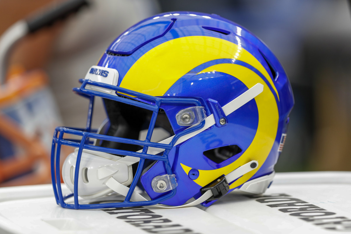
1. Los Angeles Rams
 |
| Getty Images |
The Rams came out with completely new uniforms in 2020, and these are beautiful. The royal blue and yellow pop off of each other so nicely, and the horn is classic and looks amazing here.
2. Minnesota Vikings
 |
| USA Today |
Not much needs to be said here. The horn is a staple in the Vikings uniforms and looks great on a helmet. The matte purple looks pretty sweet too. However, I think the black facemask could go. Purple would look much better in my opinion.
3. Las Vegas Raiders
 |
| USA Today |
Another absolute classic. The black and silver look of the Raiders is undefeated. Try to tell me that logo doesn't look super cool too. You can't.
4. Pittsburgh Steelers
 |
| USA Today |
Black and yellow go together perfectly (hence why all of Pittsburgh's sports teams go with that color scheme). The all black looks great with the yellow stripe down the middle, and the logo only being on one side of the helmets make these especially unique. This helmet is another staple to the NFL.
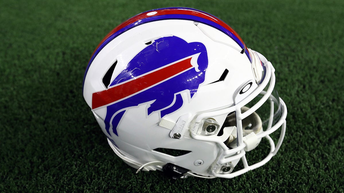
5. Buffalo Bills
 |
| Getty Images |
Going with the white facemasks full-time this season was a wonderful idea by the Bills. The all-white looks so clean with the royal blue and red logo that is pretty cool itself. This is one of those that I could have even ranked higher on this list. It is that good.
6. Cincinnati Bengals
 |
| USA Today |
The tiger stripes have become an iconic look for the Bengals over the years. This is a really unique and clever design, and they go together with their new uniforms excellently. Also, the black and orange go with each other very nicely. And you will even find colleges and high schools copying this design nowadays, like the Memphis Tigers.
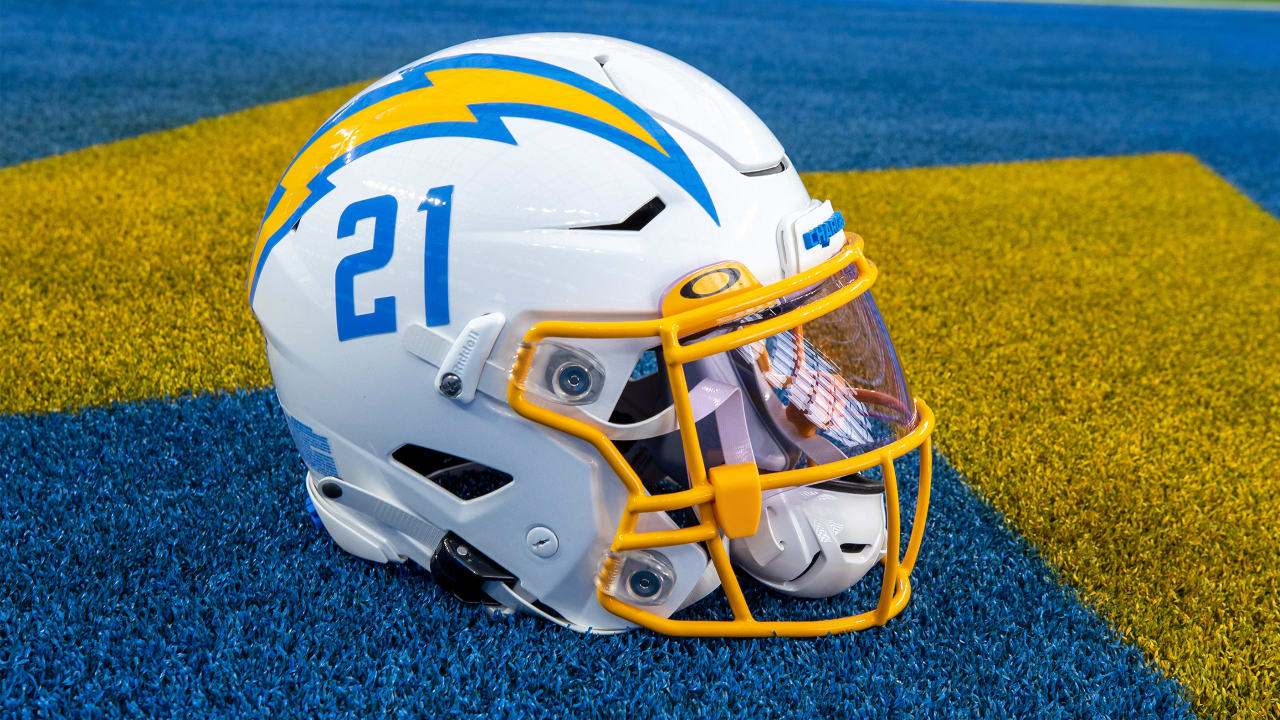
7. Los Angeles Chargers
 |
| chargers.com |
I'm going to say it...The Chargers currently have my favorite football uniforms EVER. I love baby blue and yellow, so it makes sense as to why I love them so much. This helmet doesn't cut any corners; the lightning bolt looks super cool, the number is a nice touch below it, and the yellow face mask pulls it all together.
8. New York Jets
 |
USA Today
|
Another team that did a great job with their rebranding. This metallic Jets helmet looks really nice with the new uniforms, and that Jets wording across the side of the helmet has a touch of old-school combined with new-school that really brings this helmet together.
9. Jacksonville Jaguars
 |
| USA Today |
Shiny black helmets are usually a really solid look in my eyes. These are so much better than the atrocity that was their previous helmets. They went simple with their new uniform design, and it was a win. Also, that logo is sick.
10. Philadelphia Eagles
 |
| USA Today |
Even though I wish the Eagles would go back to the kelly green, this deep shade of green looks awesome here. Those wings have become an iconic look for the Eagles though. I have no complaints here.
11. Cleveland Browns
 |
| USA Today |
The Browns could never go away from this look. For some reason, the plain orange helmet works and looks great for a team named the Browns. This is another classic look.
12. Seattle Seahawks
 |
| USA Today |
The matte navy blue looks really good with the green accents to help the whole helmet pop a little more. The bird design on these helmets is super creative and looks really cool too. This is a look that Seattle should never go away from.
13. Miami Dolphins
 |
| USA Today |
This is a really clean look that just screams Miami to me with the white, teal and orange coming together nicely. However, I actually kind of miss their old logo that had the Dolphin wearing a helmet. I certainly would not be complaining if they went back to that and I even think they will one day in the future.
14. San Francisco 49ers
 |
| USA Today |
Having a gold helmet is sick, and the 49ers red and gold go together really well. Their whole uniform set is really simple but it looks great on the field, and this helmet is no different. It is all just iconic.
15. Arizona Cardinals
/cdn.vox-cdn.com/uploads/chorus_asset/file/22829496/1234330525.jpg) |
| Getty Image |
This is the lone bright spot of the Cardinals uniforms that could desperately use an update. Even though this is the simplest of looks, it is really clean and it would be a shame if they ever decided to go away from this helmet.
16. Kansas City Chiefs
 |
| USA Today |
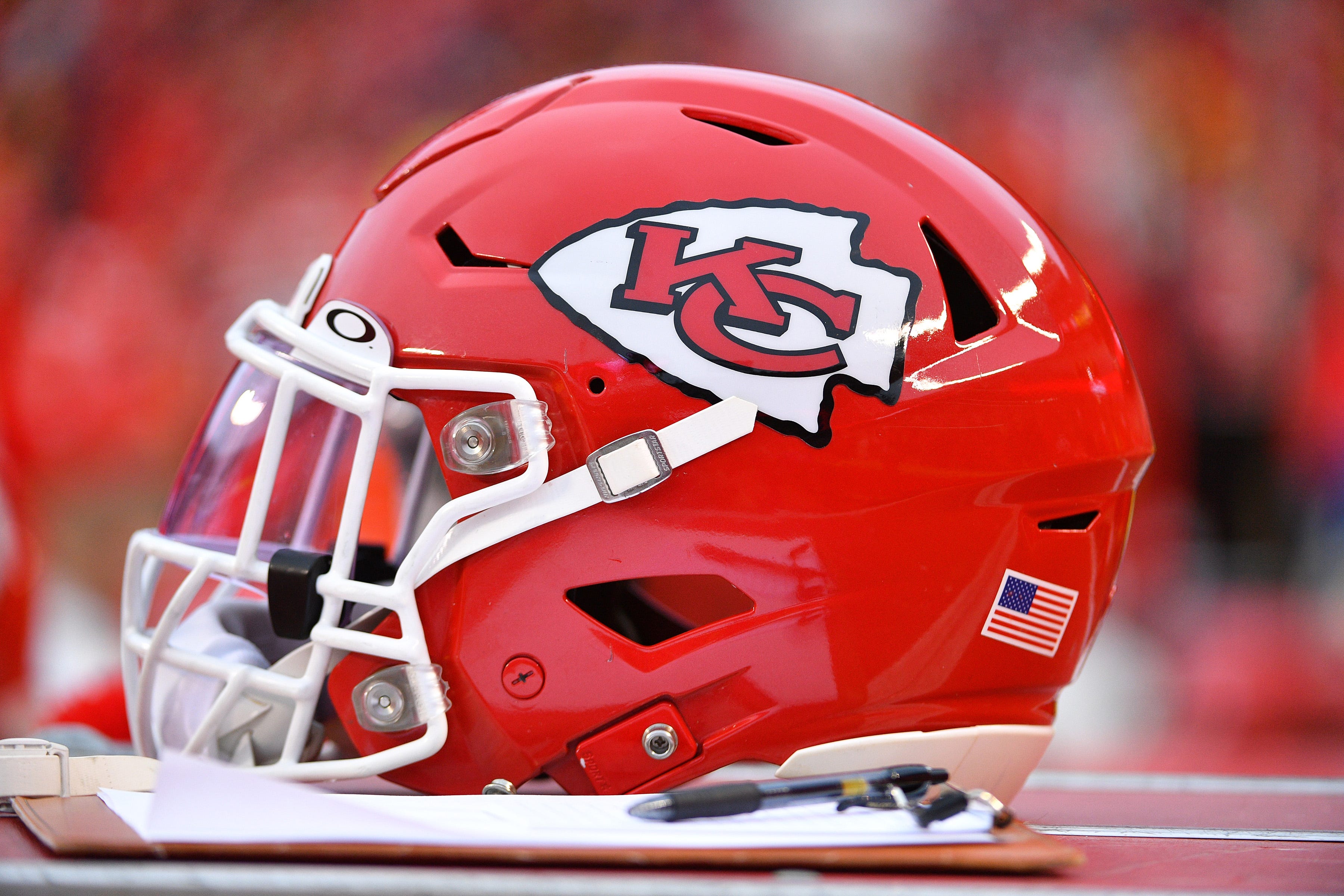
The Chiefs are another example of a team who has basically had the same uniforms for decades. But if it ain't broke, don't fix it. Kansas City is the only team in the NFL with a red helmet, and the white Arrowhead logo and white facemask complement it really well.
17. Houston Texans
 |
| USA Today |
I really like shiny navy blue helmets, and these are a perfect example. They are really simple, but the glossy looks pops and that logo on the side is pretty solid too. Now the Texans just need to get their mess of an organization cleaned up a little.
18. New Orleans Saints
 |
| Icon Sportswire |
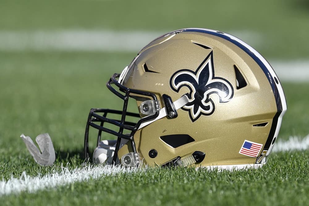
As I stated previously, gold helmets are sick. The Saints black and gold looks really good, and this helmet incorporates those two colors very well. These look especially good when the Saints wear all-white or all-black, for some reason. Another look that will probably never change but that's okay.
19. Tennessee Titans
 |
| USA Today |
The Titans made a good choice when they switched over to navy blue helmets a few years ago. I really love their colors, and they all look clean on this helmet with the grey facemask. However, I do not love their logo or the stripe down the middle, so that's why this one is not higher.
20. New England Patriots
 |
| USA Today |
This silver Patriots helmet is one that they have won all six of their Super Bowls with. The Patriot logo isn't anything flashy but it fits the team's identity, and the red facemasks look really good and make this simple helmet pop a little more. This is a good helmet. I should add that I really like the Patriot's throwback white helmets and I am excited to see those come back soon.
21. Indianapolis Colts
 |
| USA Today |
The Colts are yet another team that basically has not ever changed their uniforms, but that is usually only the case if there is no reason to switch. The horseshoe logo compliments this simple look nicely.
22. Washington Commanders
 |
| USA Today |
Washington came out with a full rebrand this offseason, going from the Football Team to the Commanders. I am not a huge fan of the new uniforms, but I think the team name is solid. I do actually like the helmets though, and they could move up or down this list depending on how I feel when seeing them on the field for real.
23. Tampa Bay Buccaneers
 |
| Green Gridiron |
The Bucs made the right choice by going back to their old uniform design while adding an all Pewter alternate. Pewter is probably one of the most unique team colors I have seen in all of sports, and it looks good for Tampa Bay. The big pirate flag logo looks pretty sick too.
24. Atlanta Falcons
 |
| Sports Talk ATL |
The Falcons tweaked their helmet a few years ago with the new uniform design, making it matte black, changing the facemask from black to silver, and making the Falcon logo a little bigger. Overall, I think the helmet looks better, but the uniforms took a step back.
25. Denver Broncos
 |
| USA Today |
Like I said earlier, I really like shiny navy blue helmets, and I actually kind of like that Bronco logo on the side of the helmets. On top of that, navy blue and orange look good together. However, I am not a huge fan of the weirdly shaped stripe in the middle of the helmet. This is also another case where I prefer the team's old helmet. That throwback D logo is pretty sweet.
26. Chicago Bears
 |
| USA Today |
Shiny navy blue again. The Bears have had this look forever so it would not make sense for them to move away from it anytime soon. This simple design will always look good with the Bears uniforms.
27. Detroit Lions
 |
| USA Today |
This is a really solid helmet overall. The Lions made a good decision of getting rid of the black in their uniforms altogether a few years back. It makes the blue and the silver pop even more. That is also a solid Lion logo.
28. Carolina Panthers
 |
| USA Today |
I really enjoy the Panthers color scheme and logo, but I think there is a lot left to be desired with their uniforms. They aren't bad at all, they just desperately need an update in my opinion. I have always thought trying out a black helmet would be cool.
29. Dallas Cowboys
 |
| USA Today |
This is the ultimate classic look, but I do not think there is anything special about it to be honest. It also bothers me that the shades of blue in the Cowboys uniforms do not match. I know this is an unpopular opinion though.
30. New York Giants
 |
| USA Today |
This is a very basic helmet and there is nothing wrong with it. However, if they made the facemask white and went back to the "Giants" wordmark across the side of the helmet it would be a lot higher on this list.
31. Green Bay Packers
 |
| USA Today |
If I wasn't such a huge Vikings fan I am sure I would like this helmet a lot more, but for some reason I just can't get myself to like it even though I love yellow. However, it would be super weird if the Packers went away from it, but I know they would never do that.
32. Baltimore Ravens
 |
| Baltimore Ravens |
There is nothing really wrong with this helmet, but somebody has to come in last. However, I do not necessarily like it either and I think they could think of something better to do with it. There is just something about their whole uniform set I do not really like. Maybe it is the weird font?


/cdn.vox-cdn.com/uploads/chorus_asset/file/22829496/1234330525.jpg)


No comments:
Post a Comment