 |
| logos-world.net |
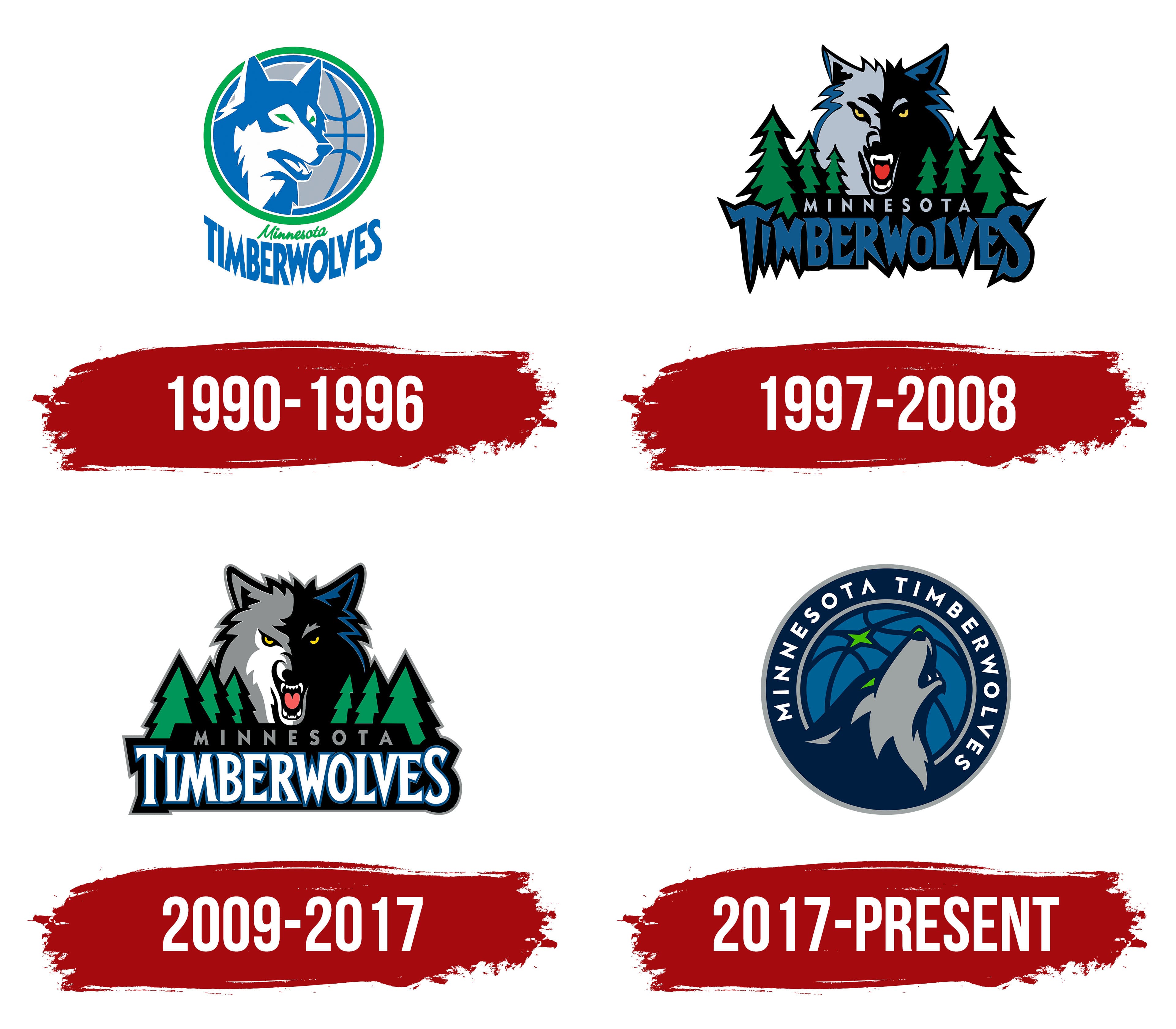
This is my third post in a row that is centered around uniforms or an aspect of uniforms, which may leave you wondering: is this becoming strictly a uniform blog? Let's not go that far! Nonetheless, uniforms are clearly a passion of mine and there are so many topics in that sector that need tackling, such as this one. The Timberwolves are a franchise with unique branding that goes along with an exciting uniform history, so without further ado...
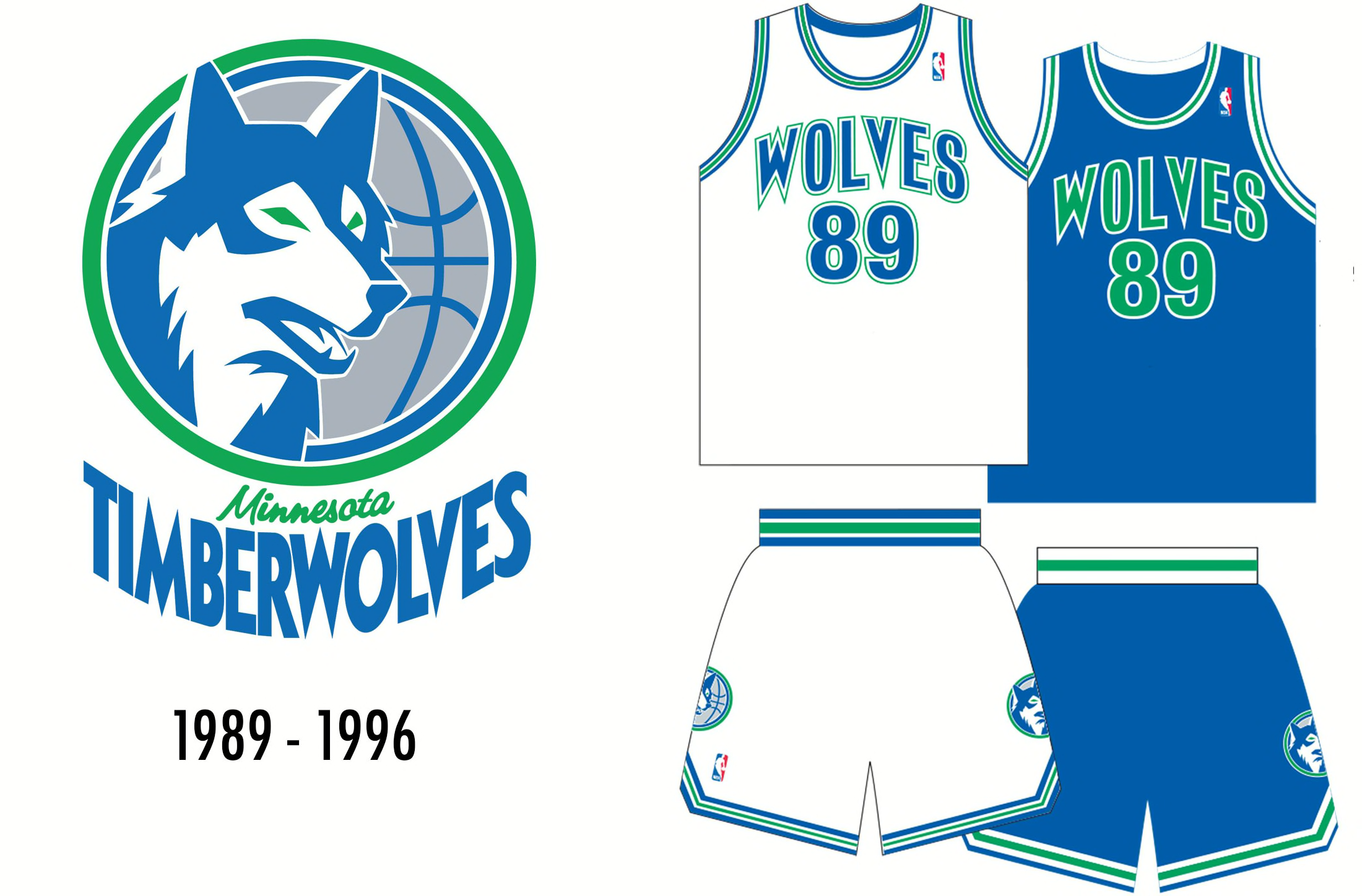
1989-1996
 |
| Hoops Habit |
Before the Timberwolves became an NBA expansion team in 1989, a "Name the Team" contest was held for fans to provide their say in what they thought the team name should be. After 6,000 submissions, the two finalists were Timberwolves and Polars. The final decision was left up to 842 city councils in Minnesota, and luckily for us, they voted on Timberwolves in the end. Even though nothing is necessarily wrong with the Polars, it just lacks the flare that Timberwolves has. Anyway, we're here to talk uniforms. These are underrated when it comes to the Timberwolves uniform history; I think this shade of royal blue and green is really sharp to go along with the simplicity of the uniform set. On top of that, this color scheme provides some uniqueness when it comes to the rest of the NBA. Even though these uniforms did not see many wins (to be fair, the Timberwolves have never done a lot of winning), they were a very solid place to start.
1996-2008/cdn.vox-cdn.com/uploads/chorus_asset/file/19935873/Minnesota_Timberwolves.jpg) |
| nba.com |
The Timberwolves went with a full on rebrand in the mid 90s and it ended up being widely considered their greatest uniforms in franchise history. Even though the trees are everyone's favorite part of these uniforms (and rightfully so), there are a few other key components that make them gel, such as the wacky font and the big logo on the side of the shorts. This look is filled to the brim with uniqueness and identity as it really screams Timberwolves. They also had far and away their most successful years in these with many playoff seasons encompassing Kevin Garnett's legendary Timberwolves career.
2008-2010
 |
| NBA Jersey Database on Tumblr |
When the Timberwolves went away from their coolest uniforms in team history, it kind of feels like they picked the worst design they could from the drawing board and stuck with it. Luckily for everybody involved, they only stuck with this look for a couple of seasons. I see what they were trying to do by keeping the trees involved just in a different way. But man, it looks bad. Such a shame considering what came before.
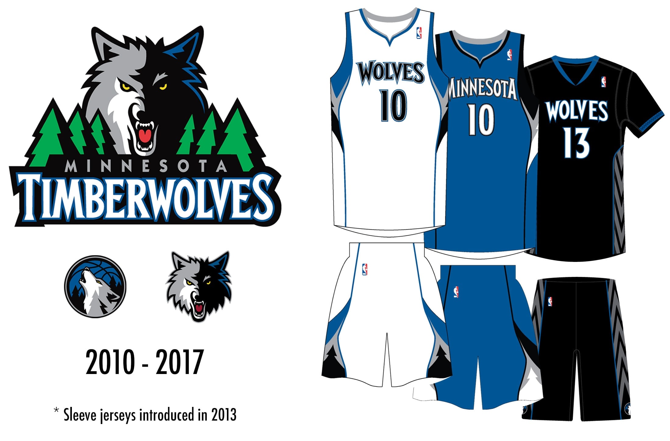
2010-2017
 |
| Hoops Habit |
Fortunately for the eyes of Timberwolves viewers, the team quickly moved away from the set shown previously and donned this altered look up until 2018. These are much more cohesive than what came before them. Even though the green was removed, they at least look decent and allowed for the Timberwolves to not feel any further embarrassment since the way they played probably was more than sufficient enough in doing that. Lack of team success aside, these were a serviceable look but always left something to be desired as a result of how good the original trees looked.
2018-present |
| nba.com |
At the end of the 2017 season, the Timberwolves unveiled another complete rebrand for 2018 and beyond featuring navy blue, royal blue and lime green as their primary colors. Believe it or not, this is probably my favorite logo in franchise history. I have always thought the howling wolf was cool and the addition of the North Star was a nice touch. Even though this uniform set is really solid and has a sense of uniqueness to it with the striping, it severely lacks in the identity department. While boring is not always bad, it usually isn't ideal when your team name is centered around a scary animal and your beloved previous branding was anything but boring.
Now that we have gone over all of the primary uniforms that the Timberwolves have rocked throughout the years, let's get to the most important part of this post...
Proposed Rebranding
 |
| nba.com |
The Timberwolves absolutely knocked their City edition uniforms out of the park for the 2021-22 season, blending elements from all of their previous uniform designs into one. To me, these are almost perfect: they include the best color scheme in franchise history, the trees and font from the KG era, and the big logos on both sides of the shorts. However, if I am being extremely nitpicky, the only thing I would change is removing the element used from the 2018 city jersey, aka the darkening from the front of the jersey to the back. Although it doesn't look bad, I think it would look more cohesive as one solid color.
With that being said, the Timberwolves should come out with a full rebrand based upon this uniform. In my opinion, this rebrand is staring them right in the face since fans absolutely raved about these uniforms. Plus, it would just be so easy. Make a white version of this jersey for at home, keep this one for the road, a green one as the Statement jersey (obviously using the original shade of green, NOT neon green), and a black one for the City jersey. I would be okay with tinkering around with the wording; that isn't necessarily what is important to me (for example: having the white ones say "Wolves" and the blue ones say "Minnesota", maybe one of them saying "Twin Cities" or full on "Timberwolves"... you get the point).
Luckily, Instagrammer @mtd.designs put together an awesome concept that lines up very closely with what I was thinking:
I'm grateful for the amazing job that @mtd.designs did in designing this, and it coincidentally is almost exactly what I envisioned for them too. As for the alternates, the greens came out very nicely and the blacks look very sleek while paying homage to the original trees. Now, all that we have left to do is make sure A-Rod and Marc Lore catch wind of this and we'll have the rebrand we so desperately want in no time.


/cdn.vox-cdn.com/uploads/chorus_asset/file/19935873/Minnesota_Timberwolves.jpg)


No comments:
Post a Comment