 |
| Around the Block Network |
Heading into the 2022-2023 season, the NFL has finally changed their one helmet rule and is allowing teams to add another alternate lid to their collection if they would like to. This is a rule that many fans have been wanting the NFL to get rid of, and they finally did it this season to the excitement of uniform geeks like myself. Without further ado, in no order my thoughts on each new alternate helmet are presented below.
Chicago Bears
 |
| Photo via Chicago Bears |
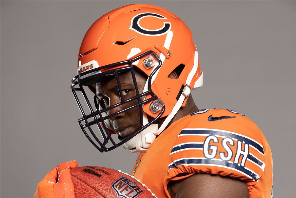
I have always been very fond of the Chicago Bears orange jersey and have considered it a nice way for the team to branch out a bit from their very traditional primary uniforms. However, for some reason I am not really feeling the orange helmet with the orange jersey. The classic, shiny blue helmet paired perfectly with the bright orange jersey, and I felt like they each made the other one pop a little bit. Although I do not dislike the helmet at all, this is just overkill to me. Who knows, maybe my thoughts will change a little when I see them on field for the first time. But as of right now, I much prefer the way the blue helmet looks with the orange jersey.
Carolina Panthers
 |
| Photos via Carolina Panthers |
For the entirety of the Panther's existence, they have donned the same uniforms with the same helmets, albeit with a few minor additions like black pants and blue color rush uniforms. Even though this uniform set has always been solid, I have felt that they could use more of a modern update to go along with their unique colors. With that being said, the implementation of a black helmet is a solid place to start. I believe that they should focus on their black and blue and use silver as more of an accent color. This helmet just does a better job of complimenting their uniforms and I am excited to see if they will wear them with any combinations other than all-black, especially considering that the helmet goes with almost all of their uniform combinations pretty well.
Dallas Cowboys
 |
| Sports Illustrated |
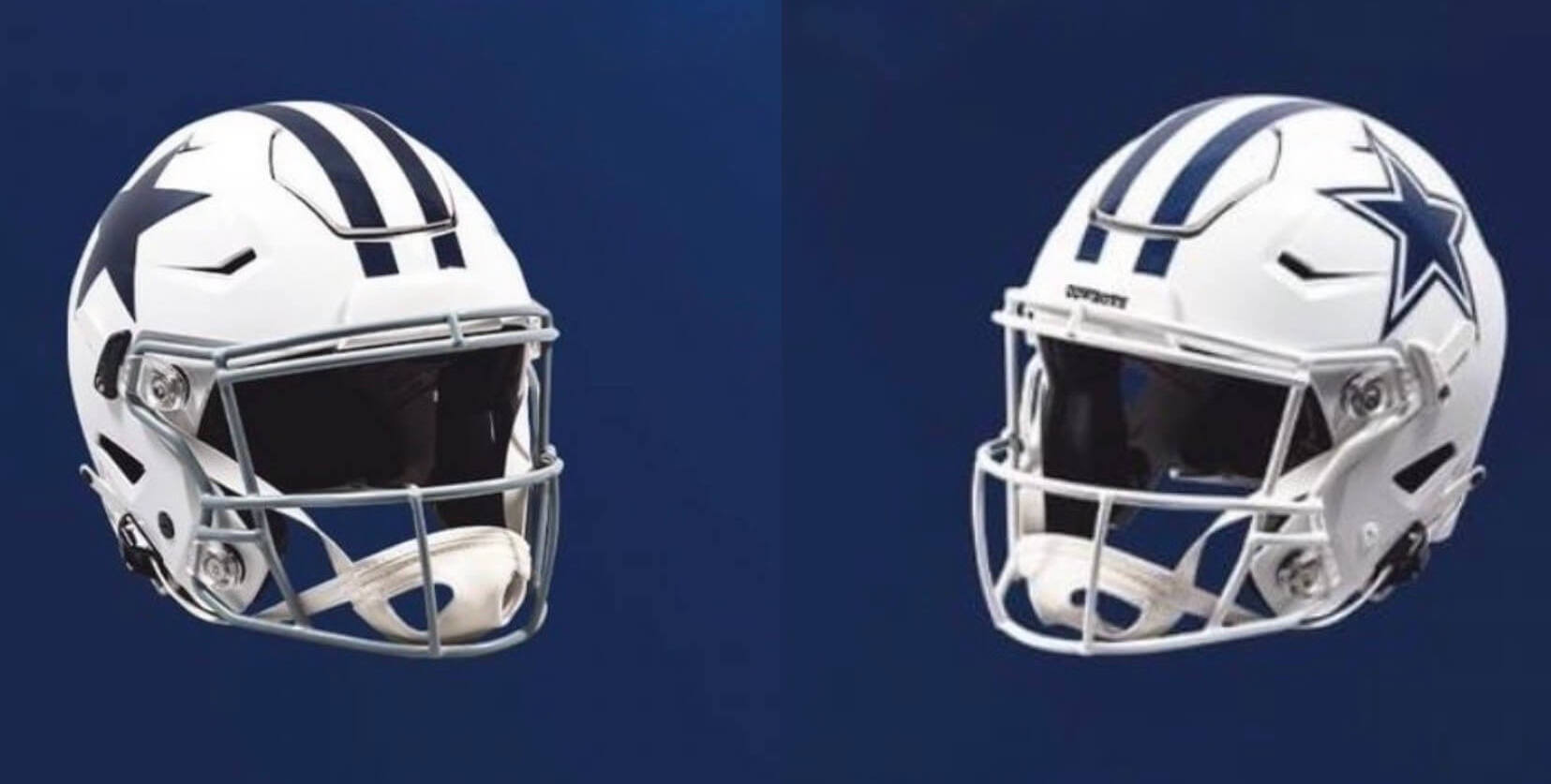
With the one helmet rule being abandoned the Cowboys wasted no time in bringing back their throwback uniforms with the iconic white helmet to go with it. However, a little wrinkle that many fans are not aware of is that they will also be wearing their white helmets with their white color rush uniforms this year. As you can see above, the throwback helmet on the left will don the original Cowboys star and a grey facemask while the color rush look will use the modern star and a white facemask (teams are allowed to use multiple different facemasks on the same helmet). Even though is certainly an unpopular take, I actually believe that the white helmets with the throwback look is better than their current look with the silver helmets and pants. Keeping it ultra-simple with navy blue and white looks so clean in comparison to the multiple different shades of silver and blue used in the Cowboys primary uniform pictured below.
 |
| USA Today |
Atlanta Falcons |
| sportslogos.net |
The Falcons are another team to immediately bring a throwback look back into the mix, with this one including their classic red helmets with black and white decals and a hint of gold running along each side of the stripe. I love this look for them and there is just something about it that I like so much more than their modern helmet and logo combination. Maybe it's the uniqueness of a red helmet to go along with the simplicity of the black jerseys and white pants. All in all, I certainly would be an advocate for them making the red helmet their primary look to go along with the throwback 'F' Falcon logo featured on it.
Cincinnati Bengals
 |
| Photo via Cincinnati Bengals |
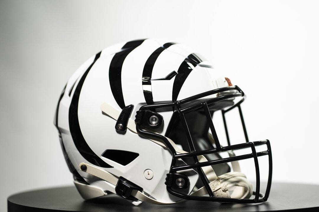
My favorite of all of the alternate helmets unveiled for this season (and now one of my favorite helmets in the entire league), the Bengals listened to their fans and created a "White Tiger" lid for the team to rock with their white color rush uniforms. Cincinnati has had a distinctive helmet design for years now with the tiger stripes, and the addition of the white alternate is just the icing on the cake when it comes to the success of their uniform redesign over the last couple of years. There is not much else to be said about this helmet besides that it is simply beautiful.
New Orleans Saints
 |
| nfl.com |
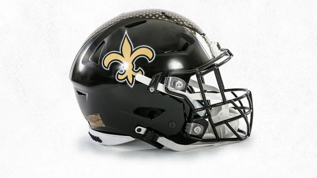
In a bit of a surprising move the Saints unveiled a black alternate helmet for this season that is intended to be worn with their white color rush uniforms. I personally am a huge fan of the look, especially with the center stripe encompassing a bunch of mini fleur-de-lis logos. You really can't go wrong with the black and gold and I expect this to add some exciting flare to a uniform set that was already really solid. I would love to see them wear this with other uniform combinations as well; I think it would look excellent with both the black and white jerseys, especially if they wear the black pants to go along with it.
Arizona Cardinals
 |
| USA Today |
Even though I am of the belief that the Cardinals desperately need a uniform rebranding, I have always been a fan of their black uniforms and think that the black helmet is a nice addition to them. I am usually a sucker for a shiny black helmet, and that is no difference when it comes to these lids. I also thought that the incorporation of the red flakes was a subtle but nice touch to give the helmets some originality. Although I would not be opposed to the Cardinals moving away from black in an eventual rebranding, I do enjoy the black in their uniforms as it seems to take some of the attention away from the rather ugly design of their jersey and pants.
New York Giants
 |
| Photo via New York Giants |
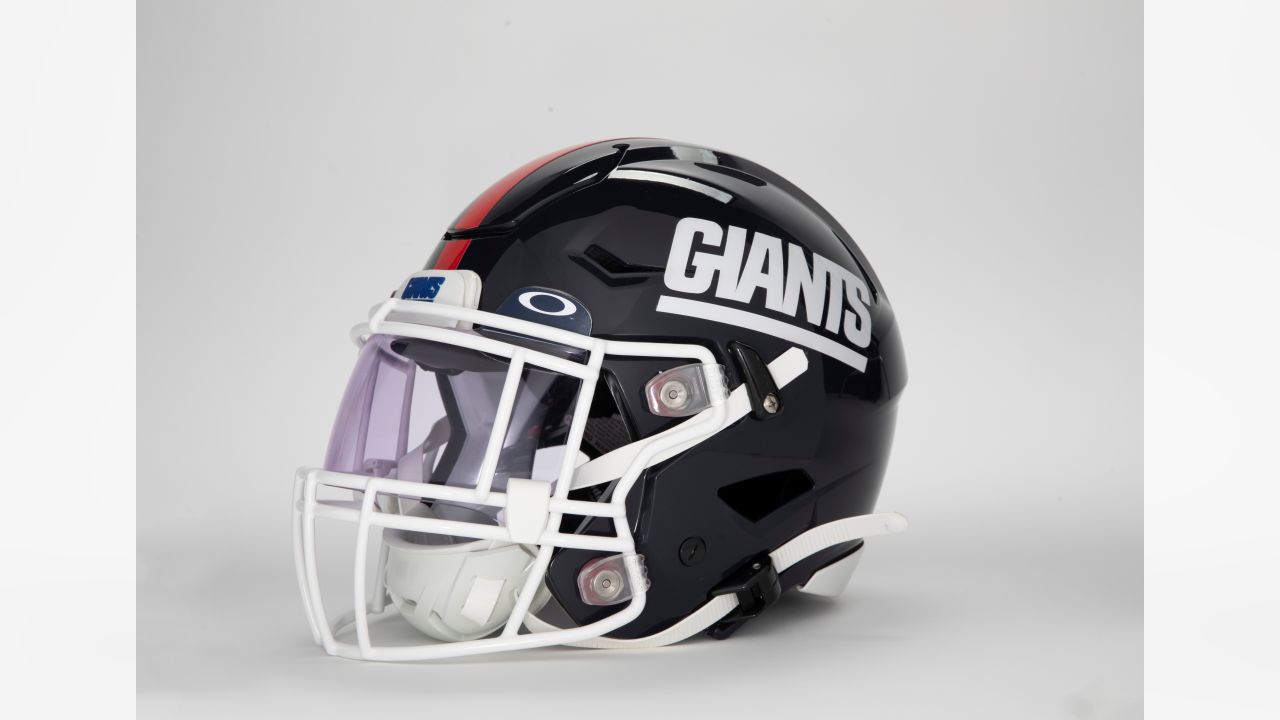
The Giants decided to bring back this throwback look for the upcoming season featuring a deep shade of blue to go along with their classic shade of royal blue on the jersey with white pants. I think they nailed this one when you consider how good the darker blue looks with royal blue, kind of reminiscent to the throwbacks the Vikings rocked in the later half of the 2000s. Additionally, I have always preferred this "Giants" logo on their helmet in comparison to the NY logo they currently use.
New England Patriots
 |
| Photo via New England Patriots |
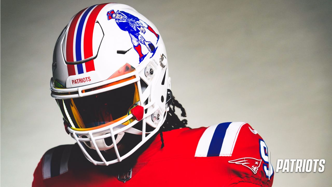
As I mentioned in my
2022 NFL Helmet Rankings, I like the Pats current branding but would love to see them go back to this throwback look on a full-time basis (However, I understand the unwillingness to change from a reliable look you won six Super Bowls in). With that being said, I was obviously pretty stoked to see them unveil these threads for the upcoming season. The emphasis on red and white with accents of royal blue looks so clean, and the Pat Patriot logo is very cool and is certainly something different than what you would find on your typical NFL helmet.
New York Jets
 |
| Photo via New York Jets |
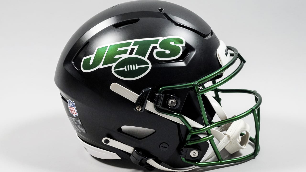
I am a big fan of the entire rebrand the Jets rolled out a few years ago from the helmets to the jerseys and pants. Nonetheless, there is nothing wrong with making minor improvements to something that was already going smoothly, and that is the case with this alternate helmet. I think the black lid will make the whole blackout uniform a little more cohesive and just give them a sharper look overall. On top of that, I wouldn't mind seeing them being creative with this and maybe trying it out with their white jersey and black pants.
Philadelphia Eagles
 |
| Photo via Philadelphia Eagles |
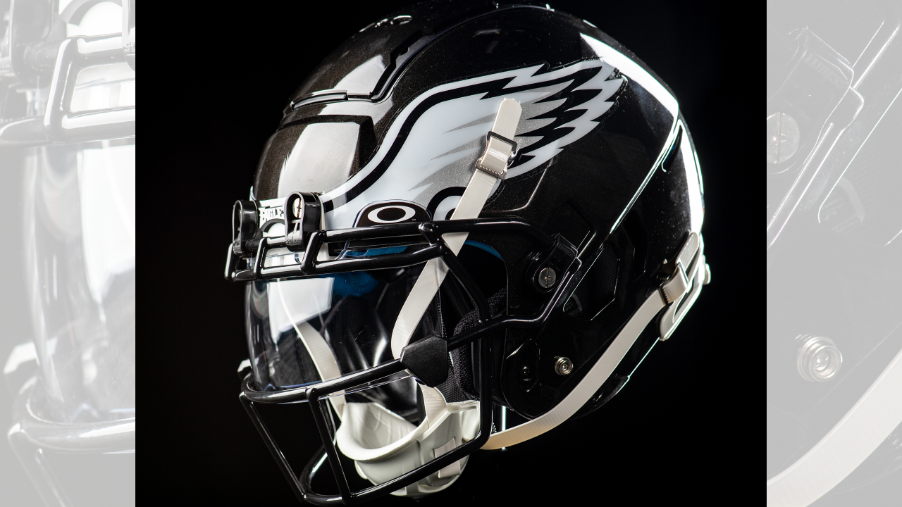
The Eagles went with a lid that is the exact same design as their current one but in black instead of midnight green; they intend to wear it with their all-black uniforms. Although it is a nice helmet with an iconic design, I almost find it to be a little unnecessary. I think the midnight green helmet looks clean with the all-black threads. Nonetheless, this is another case in which I would like to see them play around with wearing the alternate lid with other uniforms. Black helmet, white jersey, and black pants sounds like it could work. It should also be mentioned that this will probably only be a one-year thing as the Eagles are bringing back their Kelly green throwbacks next year that the fans have been anxiously waiting for.
Houston Texans
 |
| KPRC |
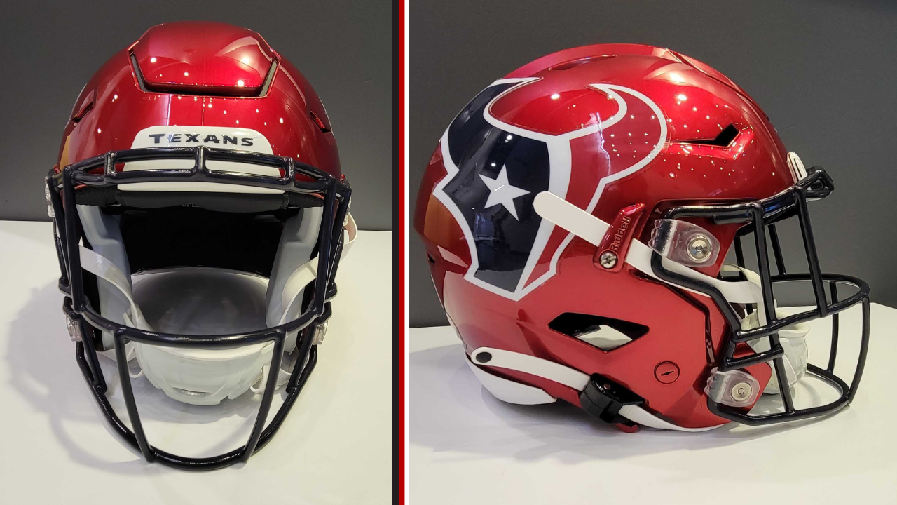
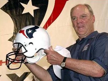
Houston was one of the first to unveil an alternate helmet with one that is identical to their blue lid except for the shell is a shiny red. I typically am a fan of red helmets, and my feelings are no different here. The Texans have a great logo and I expect this to look really nice with their red alternate jerseys. Davis Mills is going to look so cool when he's throwing touchdowns in this helmet. Also, I was actually expecting the Texans to come out with an alternate white helmet instead of red. For those of you who are unaware, when the Texans branding was originally unveiled in 2002, the owner did so by using a white helmet. The reasoning for this was that the organization believed that white was a better background for putting the logo on display instead of blue. Even though I would enjoy seeing them bring out a white helmet as well, I can't complain too much because the red one is pretty sweet.
 |
| Alex Barth on Twitter |
Washington Commanders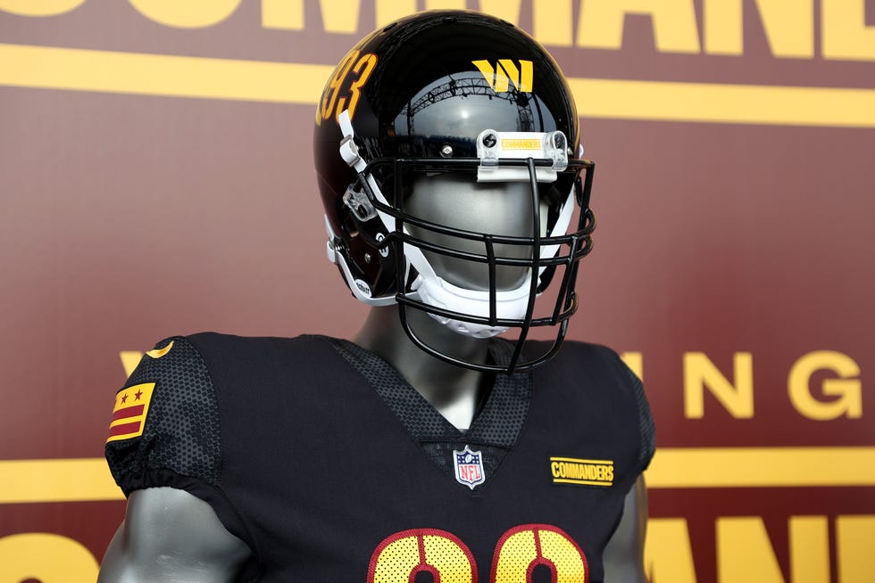 |
| Getty Images |
Washington went with a full rebrand by changing their nickname the Commanders and putting out new uniforms. For an alternate look, they went with all-black (even though black has never been one of their colors) and that comes with a black lid featuring numbers on each side and their "W" logo placed directly on the front. Overall, I do not really understand the direction the Commanders are going in here. The black feels out of place and the placement of the logo seems awkward and forced.


No comments:
Post a Comment