 |
| Brace Hemmelgarn/Minnesota Twins |
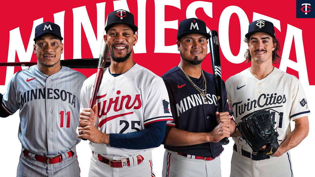
Last Friday, the Minnesota Twins unveiled a completely new look that includes new logos, new wordmark, and all new home, away and alternate sets. Highlighted by a new secondary logo, darker navy blue, a brand new set of creams, and the return of road pinstripes, the new look is "inspired by the past and built for the future." Additionally, the rebrand was looking to create a more cohesive and modern look with less font and design variation.
First, we will take a look at each individual uniform and then provide an overall assessment of the entire rebrand. The Twins have had essentially the same branding for around 30 years, so the new look has been polarizing amongst fans to say the least. Let's take a look at the home whites first.

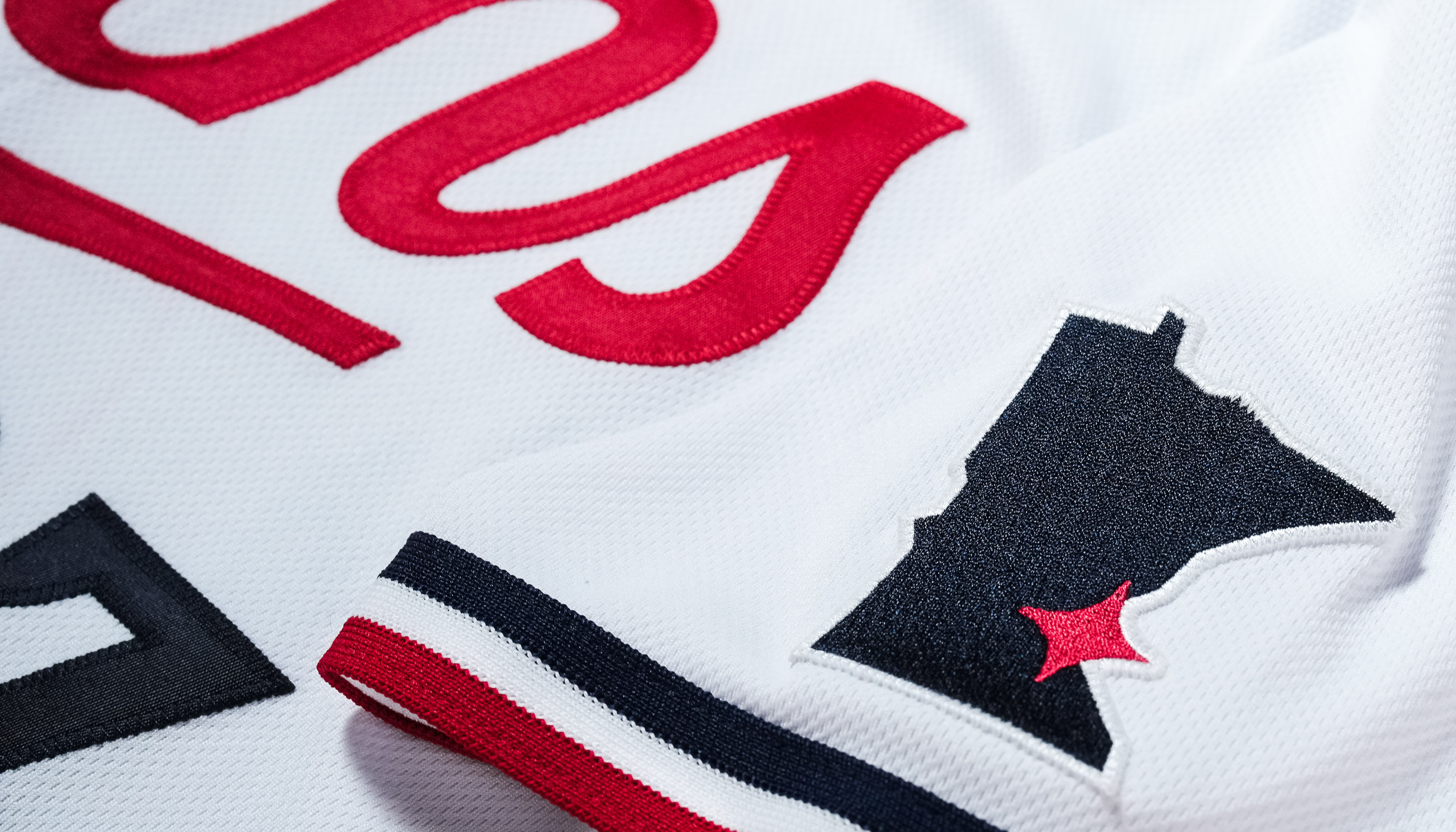
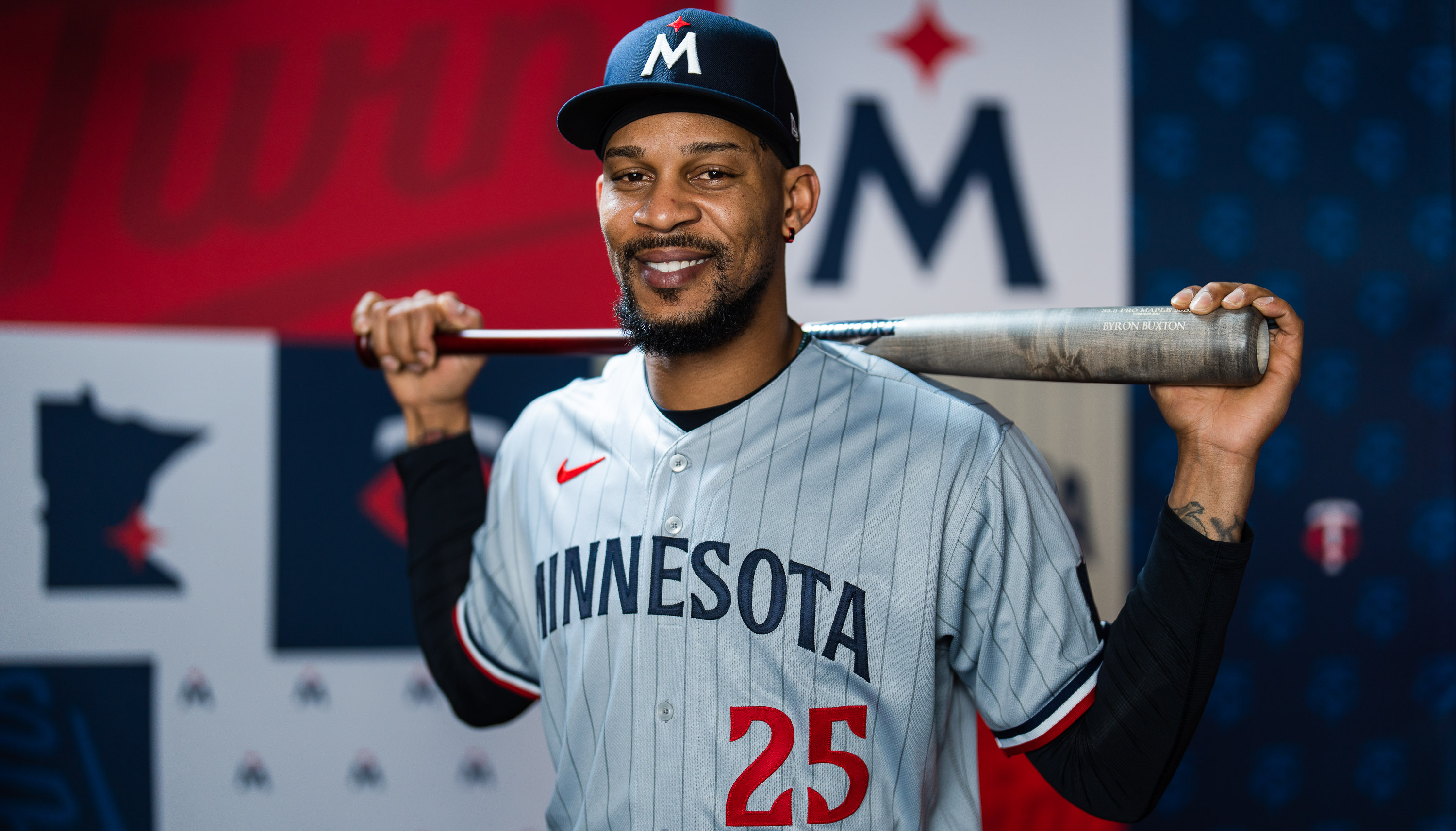
Overview: Starting at the top, the Twins primary home whites feature a navy blue cap with their tweaked TC logo in white and red. Moving down to the jersey, there is a brand new "Twins" script in red with no outline that pays homage to multiple looks of the past with an updated cursive-like font and the "win" in Twins being underlined, as it has been since 1987. Below, the number is in a solid navy blue with a new font for the numbers. The colors are flipped on the back, with the name appearing in navy blue and the number in red. Moving to the sleeves, navy blue, white, and red stripes run across the bottom with a new Minnesota state-outline patch that has a red north star over where the Twin Cities are located. The pants feature a red belt to go along with striping that matches the stripes on the jersey.
 |
| Courtesy of the Minnesota Twins |
My thoughts: Overall, I think this is a really clean upgrade that does an excellent job of doing what it intended to do, which is paying respect to the past with a new look. I think the solid red and navy blue contrast on the wordmark and numbers simply looks better, especially because neither of them have any outlines. On top of that, I was a fan of a couple of the subtle changes that they made. The altered TC logo looks slightly better on the hat, and the tri-colored striping on the pants is a classic look that makes the pants pop a little more as well as soundly match with the jerseys. However, there are a few things I was disappointed with that I would have done differently, albeit they are relatively minor complaints. First and foremost, I was really disappointed with the removal of the Minnie and Paul from the sleeve of the white jerseys. I understand that one of the main goals of the rebrand was to make the uniforms look more cohesive, especially with the logos in mind. However, I think Minnie and Paul would have looked just fine with the new design. Moreover, it is also one of the best, most unique logos in all of sports, in my opinion. It does an outstanding job of representing who the Twins are and the meaning behind their name, and it looks perfect as a patch on the sleeve.
 |
| mlb.com |
If I'm being nitpicky, I also think the white jerseys would have looked slightly better if they used the same striping that is on the sleeves along the neckline as well. Nonetheless, this is a pretty subtle component of the jerseys, but I think it would have added a little more flare and continuity.
 |
| Courtesy of the Minnesota Twins |
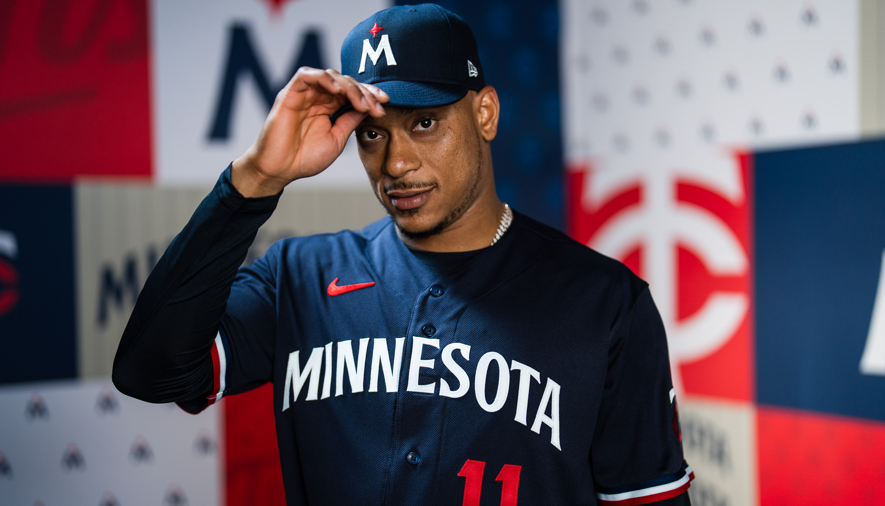
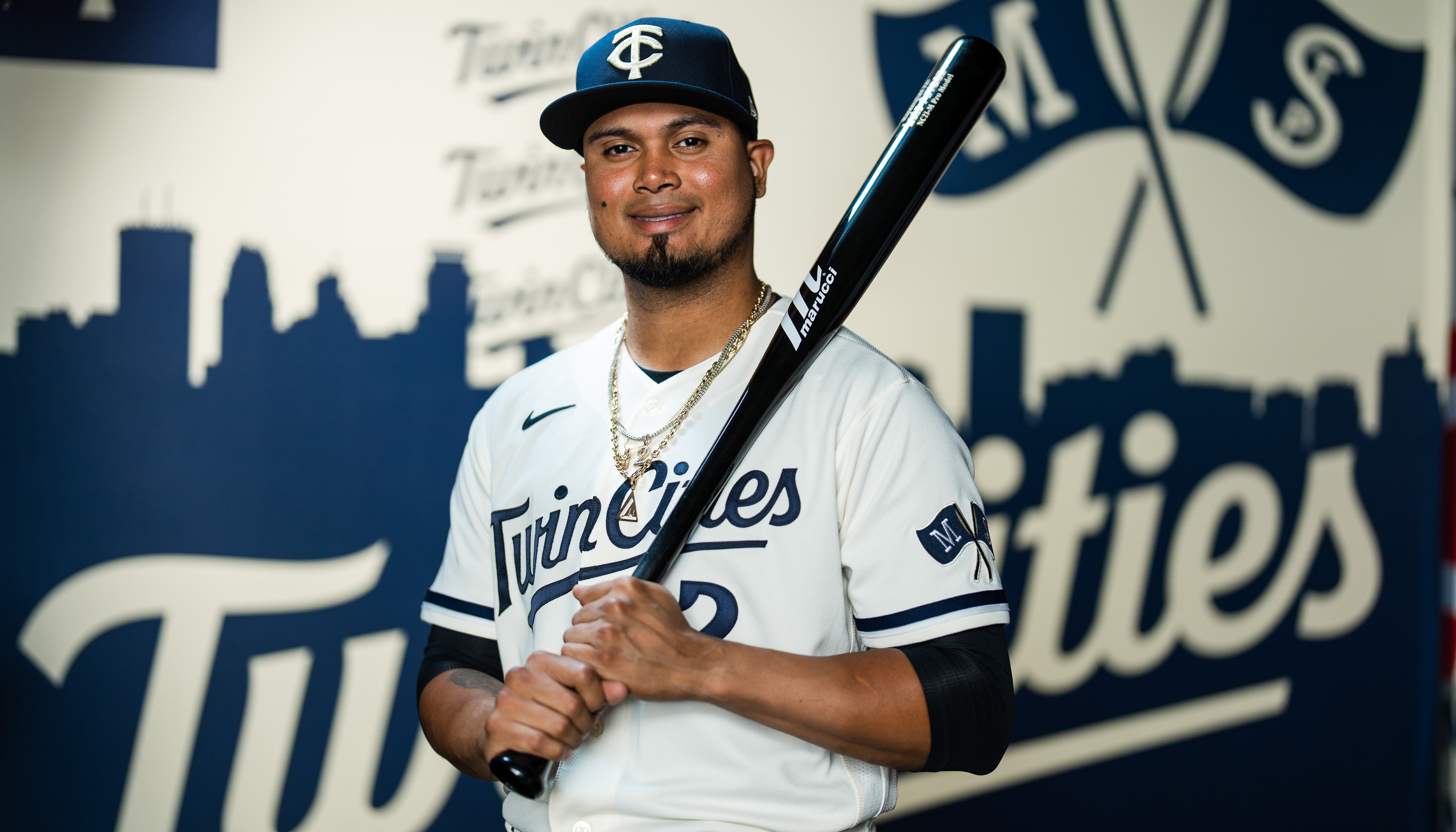
Overview: For the greys, the Twins went with pinstripes, paying homage to the road uniforms they wore when they won their two World Series championships. These uniforms feature dark grey pinstripes, the same striping on the jerseys and pants that is found on the home whites, and the same concept of contrasting colors with a solid navy blue "Minnesota" script paired with solid red numbers. They also went with a brand new white M logo on the hat with a red north star hovering directly above it.
My thoughts: I can't believe I'm saying this, but the greys are probably my favorite out of all of the uniforms the Twins came out with. For someone who is not a huge fan of greys, I was extremely impressed by what the Twins did with their new ones. Making the pinstripes dark grey instead of navy blue makes them more subtle but cleaner. In addition, the simple "Minnesota" script, the contrasting colors, the lack of outlines, and the hints of white are a blend that works really great on the grey pinstripes. In fact, I'm willing to go as far as saying that these have probably become my favorite greys in the MLB. However, I'm still not sure how I feel about their new M logo. Although I don't think it looks bad at all, I'm slightly concerned that it is a little too overly simplistic. On top of that, the logo doesn't scream "baseball" whatsoever. If someone showed that to me before I had seen it and said it was the logo of an insurance company, I wouldn't have been surprised in the slightest. But I am not here to just bash the new logo. It still looks good and compliments the new uniforms well; it just might be a little too simple and the TC looks better.
 |
| Courtesy of the Minnesota Twins |
Overview: As mentioned earlier, the Twins darkened their shade of navy blue, which is particularly emphasized on these alternate jerseys that will be worn at home and on the red. They feature the same "Minnesota" script as the greys but in white to go along with a red number below it. They also utilize the same striping along the jersey sleeves. However, they slapped the TC logo on the sleeve instead of the Minnesota logo found on the home and away uniforms. To continue with the contrasting theme, the back features a white number with the last name in red on top, the opposite of the color arrangement on the front. At home, they'll wear these with white pants; on the road, they will be worn with the grey pinstriped pants.
My thoughts: This is a very simple but clean look for the Twins. I am happy that they darkened the navy blue, especially considering that the shade of navy on the hat didn't match the shade of navy on their previous alternate jerseys. There isn't really much I would change for this look except that I think the TC hat should be worn with it (as I said, I prefer that one to the M hat). They said that they will be wearing the M hat with these jerseys both at home and on the road so the home fans can see the M hats in person every once in a while. While that's fine and all, I am hoping that they will wear the TC hats with these at least some of the time and am assuming that they will eventually do that.
 |
| Courtesy of the Minnesota Twins |
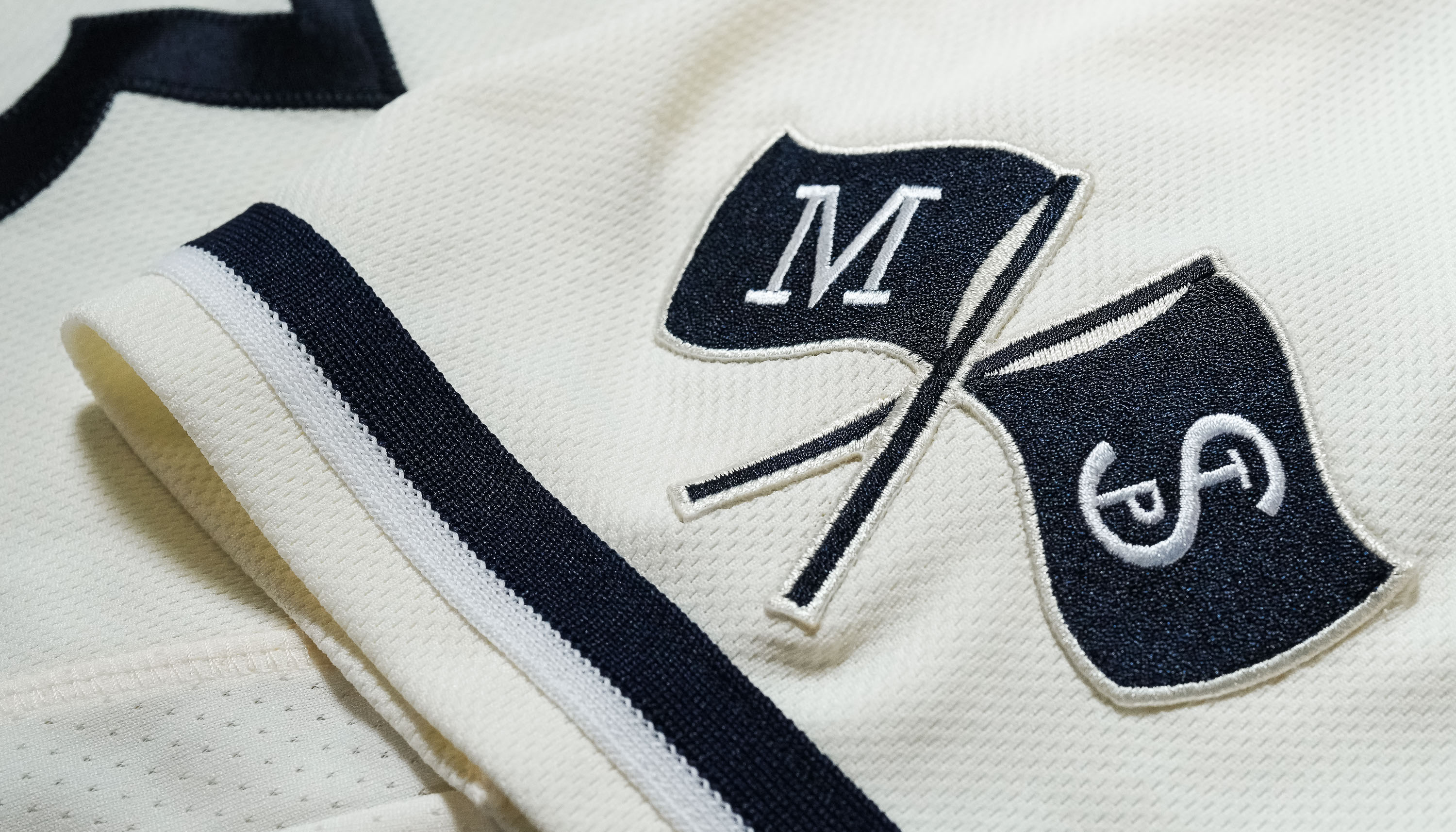
Overview: The Twins went a little out of the box with this home alternate. First, they created a navy blue hat with an all-cream TC logo. This is the first time in franchise history that the T and the C have appeared in the same color. Moving to the jerseys, these sport an all-navy blue "Twin Cities" script paired with a navy blue number. To keep with the theme of the hats, this is the first time the organization has ever rocked a jersey that says "Twin Cities" across the front. On the sleeves, there is a new patch with an M and StP logo, which is a nod to the old Minnie and Paul logo discussed earlier. The sleeves also have navy blue and white striping on the bottom, and the pants have a solid navy blue stripe running along them.
 |
| Courtesy of the Minnesota Twins |
My thoughts: I think these are really clean. Solely going with navy blue on top of the cream makes for a simple but classic look. The "Twin Cities" script to go along with the all-cream TC on the caps adds some uniqueness to a really basic look, but it comes together nicely. The M and StP flags look fine, but it kind of feels like a slap in the face when I think about Minnie and Paul being nowhere to be found on the other jerseys. Even though it feels weird to not have any red on these, they look just fine without it so I can't really complain too much there. Also, I would have liked to see some pinstripes on this set, but now that I have seen them in their entirety, they might even look better without them so I'm not too mad about that. I guess the only thing I can really harp on is that these kind of feel like a City Connect uniform to me rather than a regular alternate fixture in the uniform set. In other words, I can see how some fans may think the "Twin Cities" script and flags patch are a little gimmicky. All in all, these are very solid and it is great to once again see a cream Twins uniform, but the one-colored TC and lack of red will admittedly take a bit of getting used to.
My nitpicks: Even though I think the Twins did a really good job overall in rebranding, there are a couple things that I was quite disappointed with. First, getting rid of the powder blues was a huge failure in my opinion. I am usually a big fan of powder blues in baseball, and the Twins had easily one of the best in the league especially as a result of how good their color scheme compliments powder blue. It would have been so easy to carry them over to the new uniform set too: they could have taken the exact design of the new home whites and slapped it onto some powder blues and it would have looked amazing while paying respect to their past.
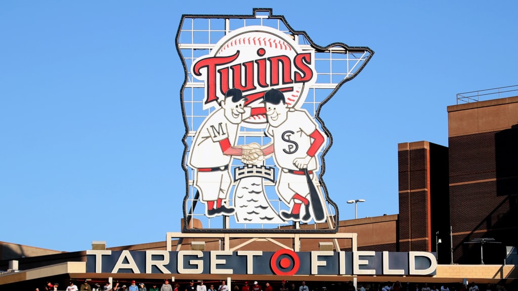
As mentioned earlier, another failure with the rebrand was the complete removal of Minnie and Paul from the jerseys and branding altogether. As I said, that is one of the best logos in all of sports so it is really sad to see it go like that. Thankfully, they are supposedly planning on keeping it in center field at Target Field, so we will at least get to enjoy it in that way.
Even though this isn't necessarily a nitpick, I'm also really going to miss the red jersey and hat. I thought having a jersey with just the TC on the front looked great, and I certainly wouldn't mind seeing it on a new alternate sometime in the future if they ever were to add another.
To sum things up, I really like what the Twins did with their new uniforms and rebrand for the most part. They were successful in completely changing the look while not straying too far away from an identity that has brought this team tradition and great uniforms in the past. The new fonts surprisingly look really good while managing to tie in similarities to past ones, and the contrasting of red and navy blue with no outlines throughout the uniform set makes both of those colors stand out individually. As touched on earlier, this was done especially well in the primary home and away uniforms, and both of those have become some of my favorites in the entire league. Overall, I think this is definitely an improvement in comparison to their previous look. Now, all that's left to do is to resign Correa and build a roster worthy of competing in the playoffs for the first time in many years.